Self-Service BI can be defined as allowing users to design and deploy their own reports from data sources such as a pre-built data model, trusted Data Warehouse, Gold/Curated layer in a Data Lake or from raw data itself. However, it can be a difficult process to implement as users need knowledge of the tools (regardless of the tool used) to connect to data sources, create data models and data visualisations whilst also ensuring that appropriate data governance is adhered to.
Power BI’s Personalized Visuals feature allows a limited and yet powerful self-service model. The user can modify data visualisations to meet their requirements, adding and removing attributes and measures to answer their specific analytical needs. In this blog post we’ll go through how to set-up this feature and how it’s used.
Please note that the reading time of this blog post will vary depending on the time taken to complete each step if you are completing each step along with the blog.
The example Power BI Desktop file and dataset is available from GitHub here.
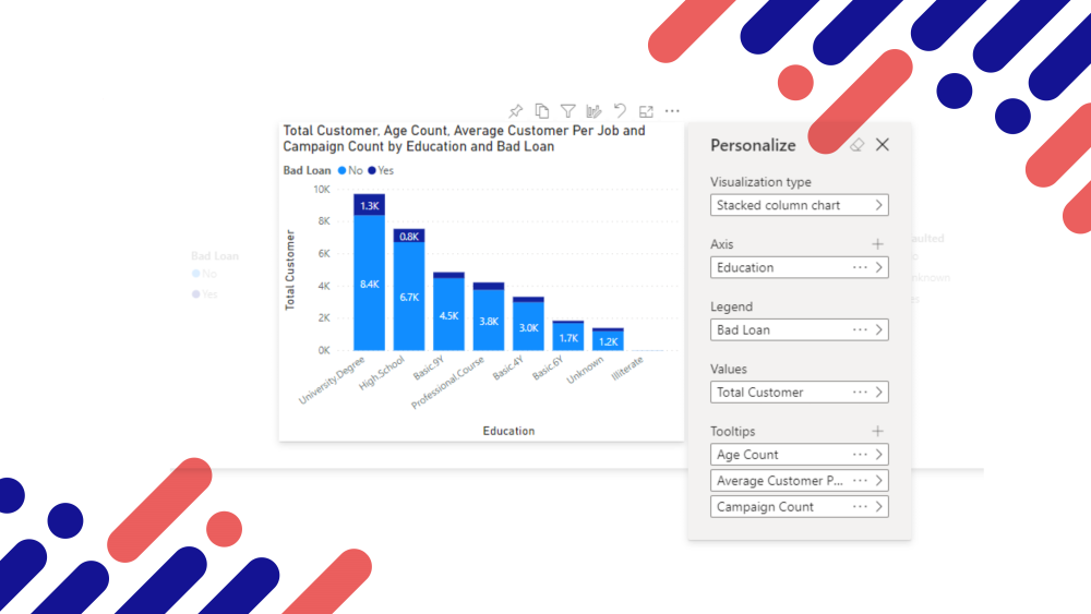
The following image shows changing a visual by selecting a new visualisation type and editing axis values.
There are 2 roles to understand when using Personalized Visuals:
- Report Creator: Activating the option in Power BI Desktop and the Power BI Service.
- Report Viewer: Interacting with each visual to edit as required.
Workflow
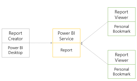
The workflow for using Personalized Visuals starts with the Report Creator who builds the report in Power BI Desktop and activates the ability for Report Viewers to interact and change visuals. The Report Creator then deploys the report to the Power BI Service. The Report Viewer can then browse the report, make changes to visuals enabled for editing and save these changes as Personal Bookmarks. The Report Viewer can then return to the report at any future point with the changes saved as a Personal Bookmark.
There are 2 main areas in this blog post, although you can read in sequence you can also jump to the relevant section appropriate to your role working with Power BI.

Report Creator
The following steps are aimed at the Report Creator as it’s this role that is responsible for enabling the Report Viewer to personalise visualisations in the report. To work with Personalized Visuals, you must have the Power BI Desktop release from or after April 2020.
Enabling in Power BI Desktop
There are several steps in enabling Personalized Visuals. Enable overall feature > Enable individual report > Enable individual report pages > Enable individual visual. Each step is outlined below:
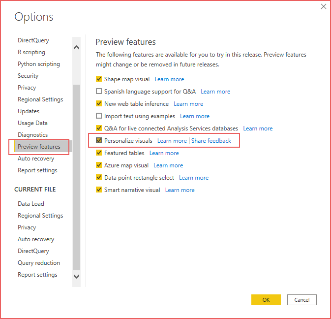
Enable Overall Feature
Please note that as of the October 2020 release of Power BI Desktop the Preview features option has been removed as the feature is now generally available.
- Open Power BI Desktop and select File > Options and settings > Options.
- Under the GLOBAL area, select Preview features and enable Personalize visuals.
- Select OK and restart Power BI Desktop
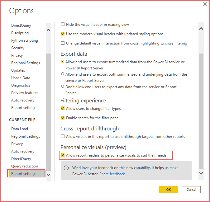
Enable Individual Reports
Once the feature has been enabled, it can now be used in individual reports:
- Open Power BI Desktop and select File > Options and settings > Options.
- Under the CURRENT FILE area, select Report Settings and under the Personalize visuals (preview) area enable the Allow report readers to personalize visuals to suit their needs.
- Select OK.
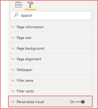
Enable Individual Report Pages
Once the report has been enabled, the feature can be enabled or deactivated on each of the report pages (regardless if the report has 1 or more pages). For example, a report may have 3 pages with 2 of the pages enabled.
- Open the Visualizations pane on the right-hand side and ensure no visuals are currently selected.
- Select the Format tab and activate/deactivate the Personalize visual toggle as desired.
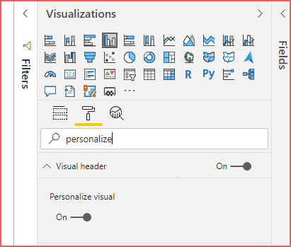
Enable Individual Visual
As each report page can have multiple visuals, each visual can be enabled or deactivated as desired.
- Create a new visual or select an existing visual on the report page.
- Open the Visualizations pane on the right-hand side and select the Format tab.
- Ensure the Visual header toggle is enabled, then expand the Visual header area.
- Ensure the Personalize visual toggle is enabled. You can search for this option in the Format search bar.
Once the report has been deployed to the Power BI Service, a Report Viewer can now personalise the visual.
Creating Perspectives
Creating perspectives enables the Report Creator to control which fields and measures are visible to the Report Viewer when editing a visual. This is not mandatory when working with Personalized Visuals, however it does help provide focus if the data model is large with many fields or the Report Creator wishes to focus on a subset of the fields.
To create perspectives, you must install Tabular Editor from here. Close Power BI Desktop before installing, then once installed, open Power BI Desktop. Tabular Editor should now be visible on the External Tools tab on the ribbon.
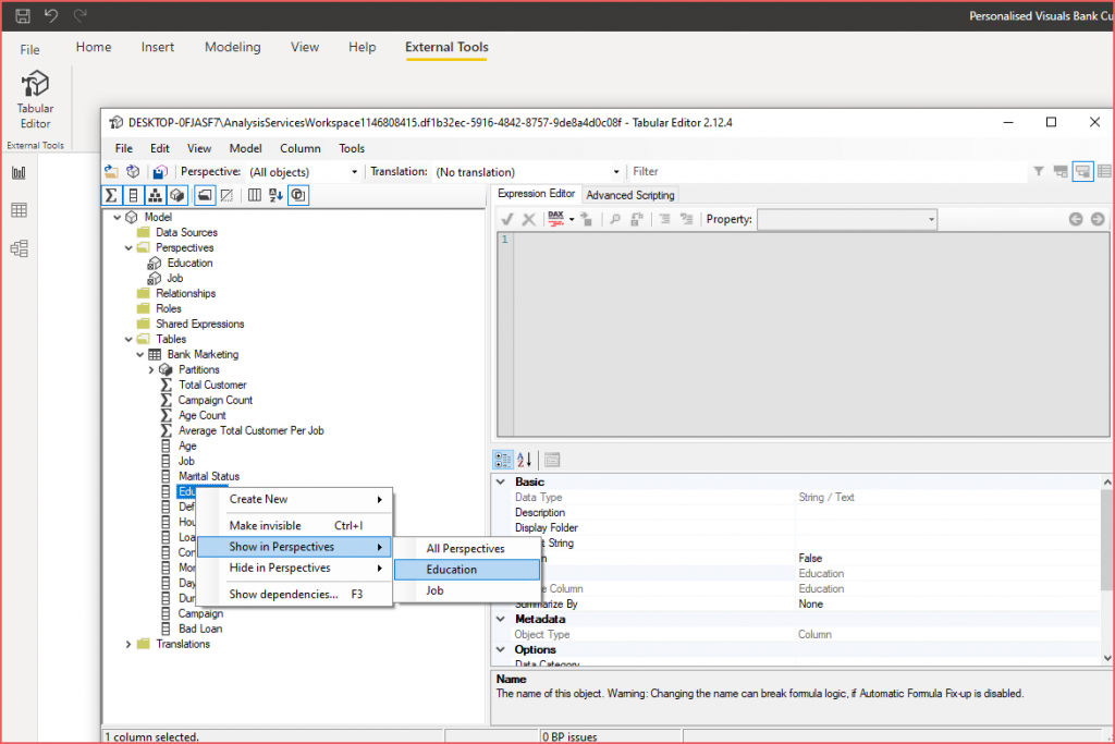
Create Perspectives using Tabular Editor
- Open Power BI Desktop and select External Tools > Tabular Editor.
- Under the Model area, right-click the Perspectives folder and select New Perspective.
- Provide a name for the Perspective. Please note that multiple perspectives can be created.
- Expand the Tables area and expand a table that contains the fields you want in the perspective.
- For each field, you can either drop-and-drag the field to the perspective or right-click the field and select Show in Perspectives then select the appropriate perspective.
- Once finished, select File > Save to ensure the perspective(s) are saved to the Power BI model.
- Close Tabular Editor.
Using Perspectives in Reports
Once perspectives have been created, they can be assigned to individual report pages. This ensures that any visual on a report page will show the assigned perspective when a Report Viewer personalises the visual.
- Open the appropriate report page.
- Open the Visualizations pane on the right-hand side and ensure no visuals are currently selected.
- Select the Format tab and expand the Personalize visual area.
- In the Report-reader perspective dropdown box, select the appropriate perspective.
- The Apply to all pages option ensures that the selected perspective is used across all report pages.
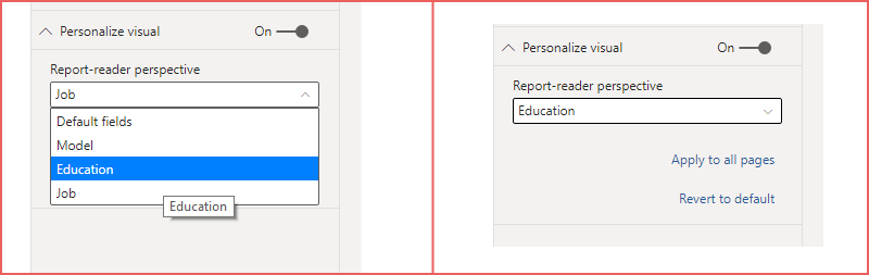
Once the report is deployed to the Power BI Service and a Report Viewer personalises a visual, they will see the perspective relevant to the report page.
Deploy Report to Power BI Service
Once the report has been completed, it can be deployed to the Power BI Service. Report Viewers with permissions to access the report will now be able to Personalize Visuals within the report.
Enabling in the Power BI Service
Once a report has been deployed to the Power BI Service, the Personalize visuals options can be enabled or deactivated. Please note that if a Report Viewer has since personalised a report and saved a personal bookmark they will no longer be able to see the bookmark if the option is deactivated. Enabling the option again will allow the Report Viewer to see their personal bookmarks as these will not have been removed when the option was deactivated.
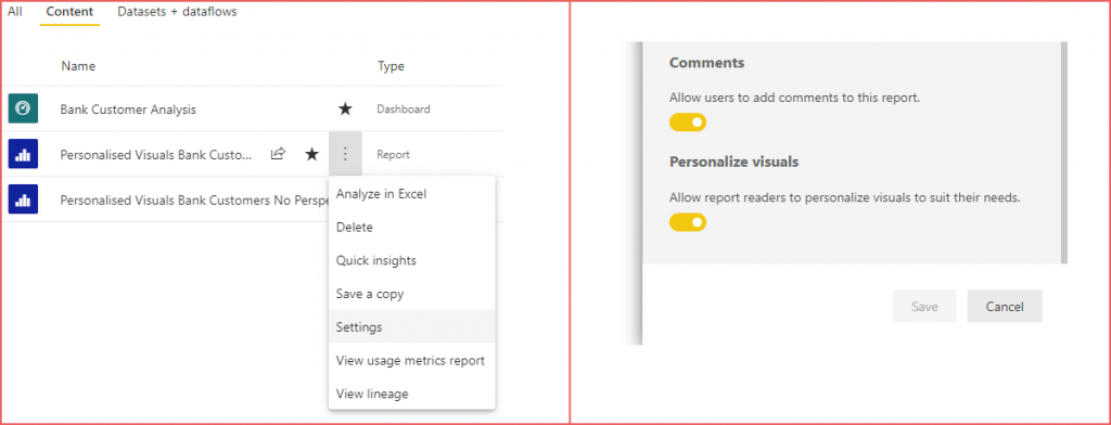
- In the Power BI Service, open the Workspace the report is deployed to.
- Select the Content tab.
- Hover over the report name and select the elipsis (more options) and select Settings.
- Activate/Deactivate the option as desired.
Report Viewer
Once a report with Personalized Visuals enabled is available within the Power BI Service, a Report Viewer with permissions to view the report can not change the visualisations to suit their personal analytical requirements.
Personalising Visuals
- Open a report in the Power BI Service.
- Hover over a visual to show the visual header, if the visual is enabled for personalisation an icon will appear as shown in the following example image.
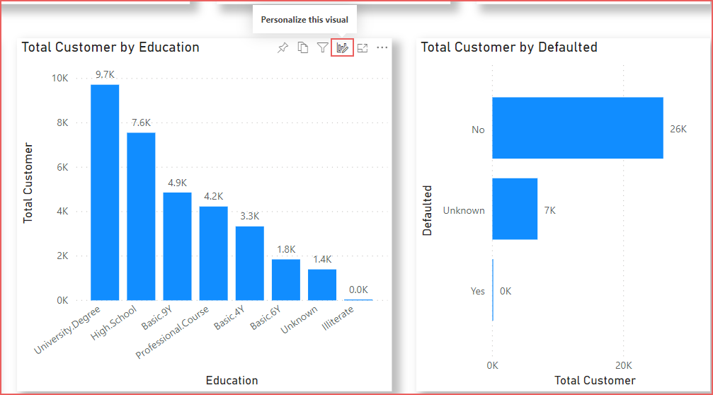
- Click the Personalization icon and the Personalize area will appear allowing you to edit the visual.
- The available options to personalise will vary depending on the data visualisation type selected in the Visualization type option. For example, Axis, Legend, Values and Tooltips are valid options for Bar and Column visualisations whereas Legend, Details, Values and Tooltips are valid options for Donut charts.
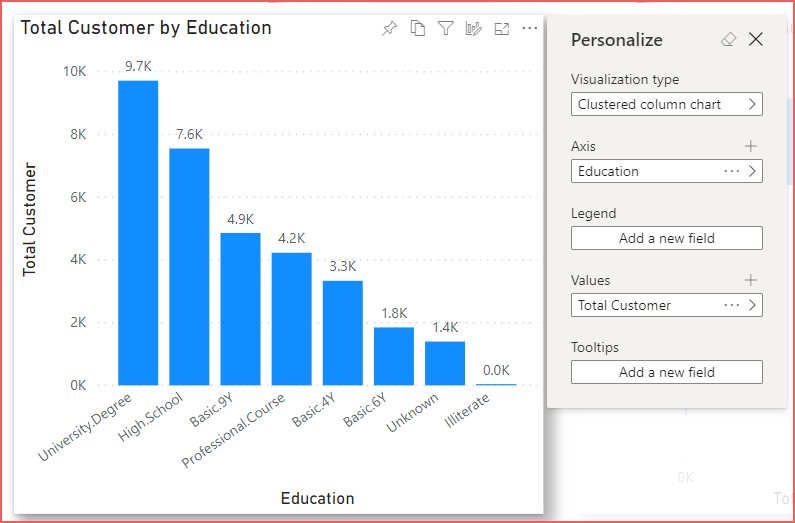
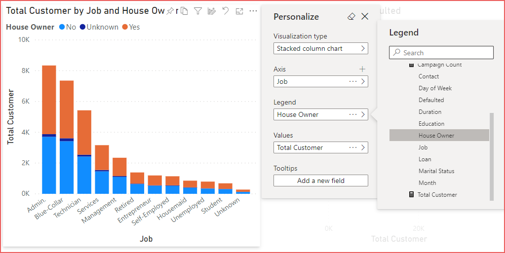
For example, to change the above chart from a Clustered Column to a Donut showing different categories on the Legend, the following steps can be completed:
- On any visual enabled for personlisation, click the Personalization icon.
- Select Donut as the Visualisation type.
- Under Legend , select the elipsis next to Education and select Remove field.
- Under Legend, click Add a new field and expand the Job perspective and select Job.
- Click the close icon (X) to close the Personalize area.
The next section details how to save the changes that are made to visuals as by default these changes are not automatically persisted.
Saving Changes as Personal Bookmarks
Once changes to a visual or several visuals has been completed, the Report Viewer must create a Personal Bookmark to persist the changes. To do this follow the next steps:
- In the top right side of the report, select Bookmarks and select Add a personal bookmark.
- Give the bookmark a relevant name and click Save. You also have the opportunity to make the bookmark the default view for the report when it is opened.
- If any further visual changes are necessary then make the changes and save the updates to an existing bookmark by selecting the elipsis next to the bookmark name and selecting Update.
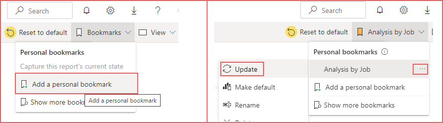
At any point, the Reset to default button can be used to reset the report back to its original format. Please note that this does not delete any existing personal bookmarks that have been created.
Conclusions
In this blog post we’ve walked through the steps necessary to enable and use Power BI’s Personalized Visuals feature. This feature can help an organisation approach Self-Service BI by allowing Report Viewers the power to personalise their data visualisations.
References
- https://powerbi.microsoft.com/en-us/blog/announcing-the-new-personalize-visuals-experience-for-power-bi-reports/
- https://docs.microsoft.com/en-us/power-bi/create-reports/power-bi-personalize-visuals
- https://docs.microsoft.com/en-us/power-bi/consumer/end-user-personalize-visuals
- https://www.sqlbi.com/tools/tabular-editor/
- https://automlsamplenotebookdata.blob.core.windows.net/automl-sample-notebook-data/bankmarketing_train.csv
Aggregations (1) ALM (1) Architecture (2) Bicep (1) C# (1) Certification (5) Community (2) Databricks (4) Data Engineering (1) Data Factory (5) Dataflows (5) Data Flows (3) Data Lake (2) Data Lakehouse (1) Data Saturdays (1) Data Warehouse (3) Dedicated SQL Pools (2) ebook (1) Enterprise (1) Event Hubs (1) Events (1) Framework (1) Frameworks (1) Learning (1) Logical Data Warehouse (3) Power BI (15) Power Query (1) Purview (1) Real-time (2) Round-up (1) Security (2) Self-Service BI (1) Serverless SQL (3) Sessions (2) Snowflake (1) SQL Serverless (14) Streaming (2) Synapse Analytics (20) Synapse Pipelines (1) Training (1) TSQL2sday (1) Tutorial (3)
- T-SQL Tuesday #163

- Cloud Formations: A New Training Initiative Led By Microsoft MVPs

- A New Badge…But Is It Useful? Databricks SQL Analyst Accreditation

- 2021 Review and Thanks

- Applying the Azure Well-Architected Framework to Azure Synapse Analytics

- Optimising Power BI with Synapse Analytics Serverless SQL Pools Session
- Connecting Power BI to Azure SQL Database using Private Endpoints
- Costs and Estimated Savings using Azure Synapse Analytics Pre-Purchase Plans

- Snowflake Hands On Essentials – Data Warehouse

- Applying the Azure Well-Architected Framework to Azure Synapse Analytics